Child-Safe
Website Redesign
Nurturing trust and building legitimacy as a children's safety trainer.


The brief
ChildSafe is an harm prevention charity offering a variety of trainings and services, to help create safer environments for children.
They have a wide customer range from sports clubs, schools, churches and private businesses.
Their website had a 60% bounce rate within 2 clicks.
To reduce it, we needed to understand:
Are users finding what they expect when they land on the site?
Is the call to action clear and compelling?
Does the current design has any limitations?
My role
I took ownership of the research.
Which included:
Preparing and running interviews and user testings
Competition analysis
Compiling & analysing data
Creating data assets (affinity map, customer journey map, MVP…)
I was involved in the designing phase, by designing the new Information Architecture.
The cherry on top: 8 designers | 1 project
A team of 8 designers working remotely.
Having 8 brains can be a super power but only if used properly.
Additionally, we had a limited time of 4 weeks stretching over Christmas and New Year.
Therefore, we needed to be quick and decisive in our decisions.

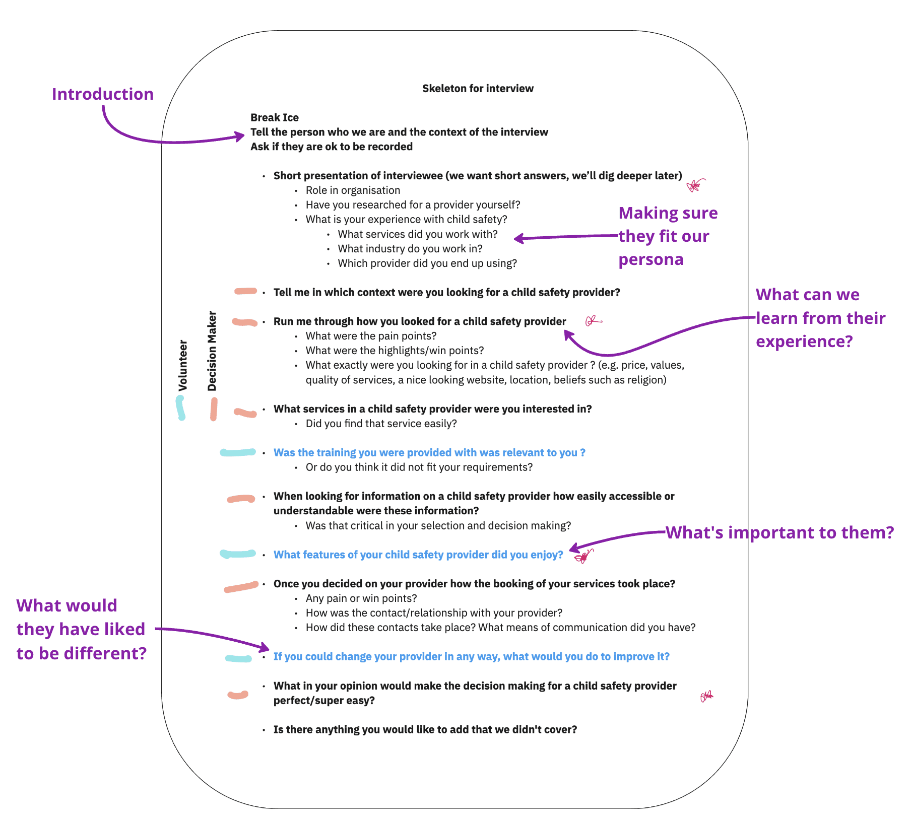
Interviews
Learning "How" and "Why" users choose their current providers.
We interviewed professionals that were undergoing child safety training.
They were involved in sport clubs, education or children psychology.
Interview Template
Usability Testing
Using the same professionals, we assessed the current design to point out pain points
We wanted to find out the “what is wrong” with this website.
Scenario Template

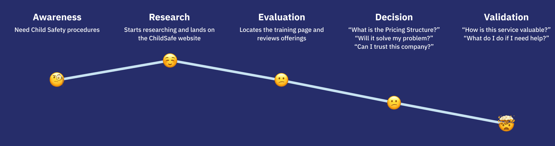
The Insights
According to our research, users struggled with:
Finding the right course was not made easy.
The legitimacy was hard to find.
The website was hard to navigate.
"I am not sure if these courses are the right fit, I'll have to send an email and ask"
"I must have faith in the organization and the coaches"
"The menus are confusing"
Customer Journey
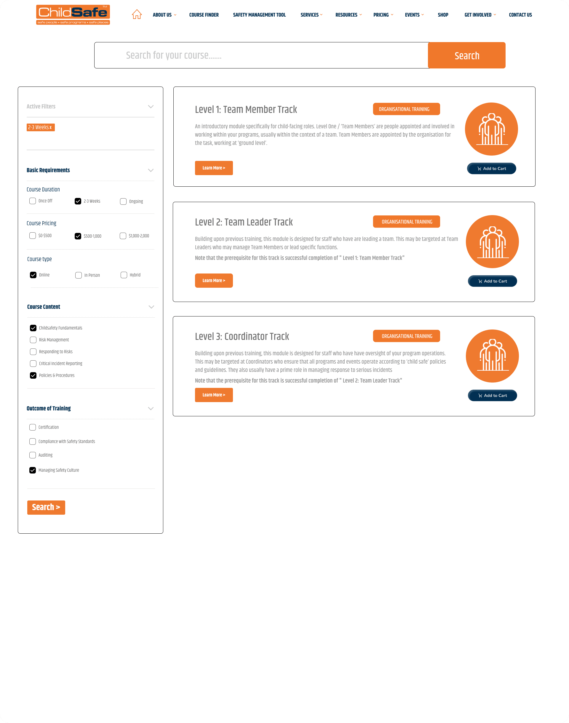
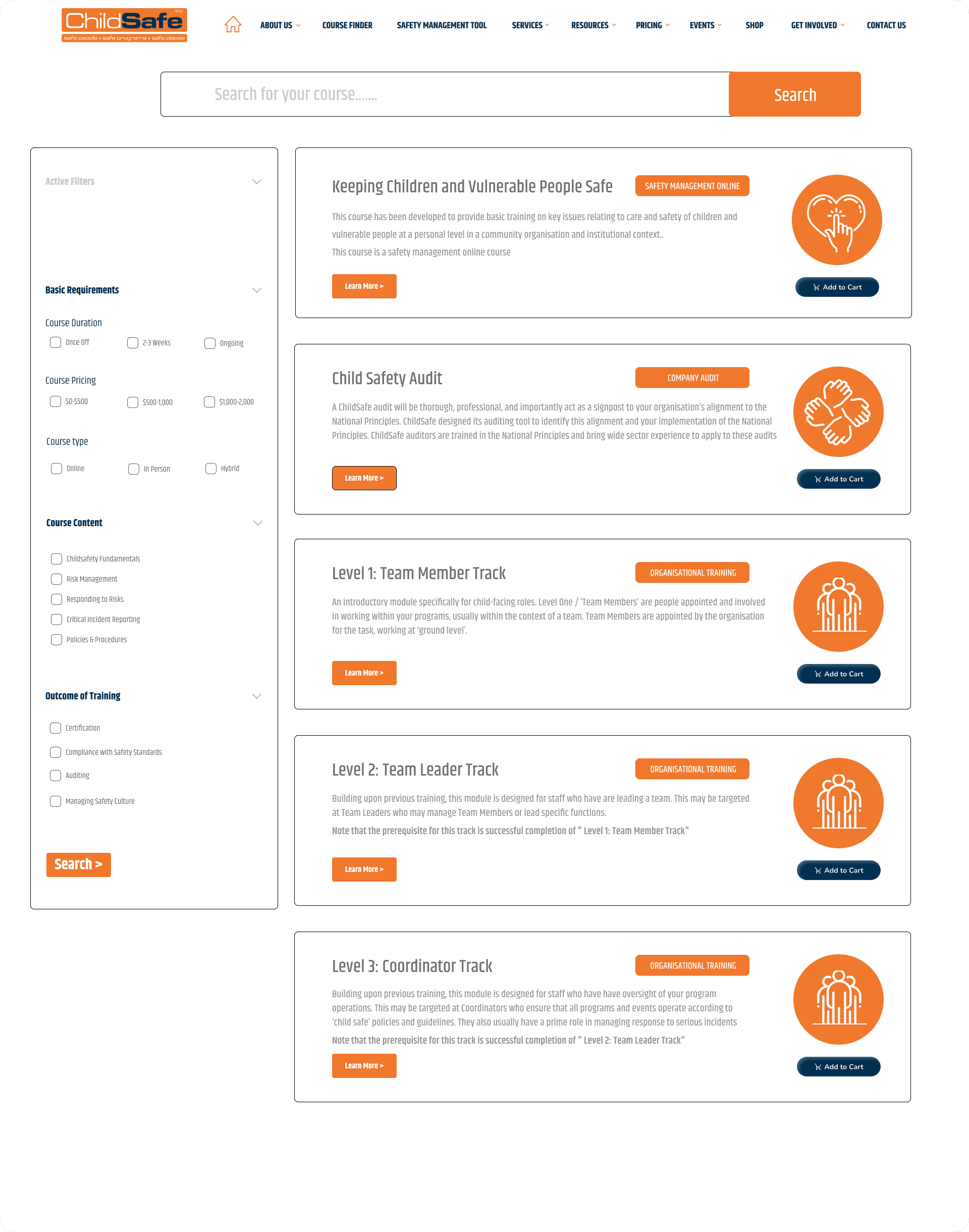
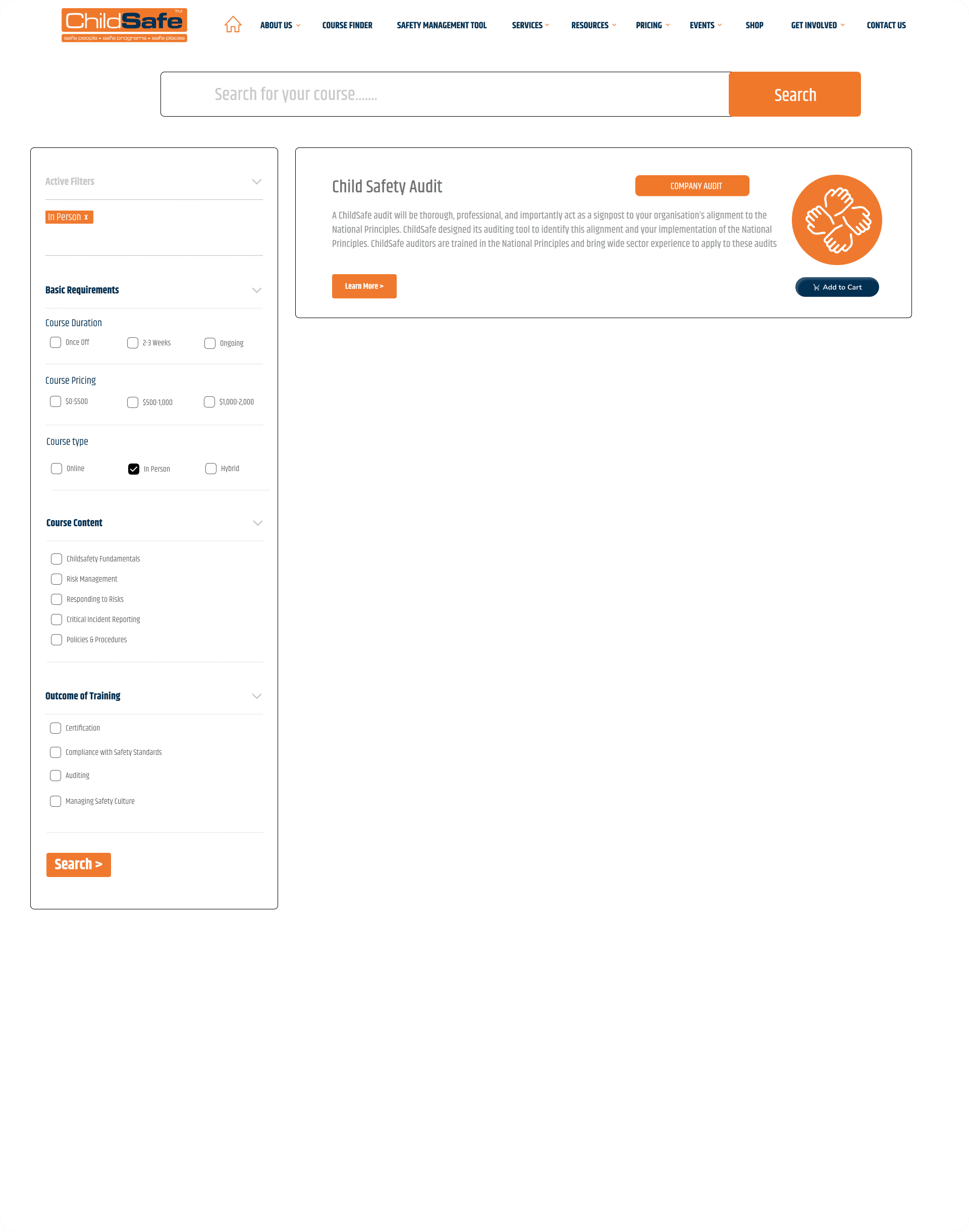
Find The Right Course
Filter Tool


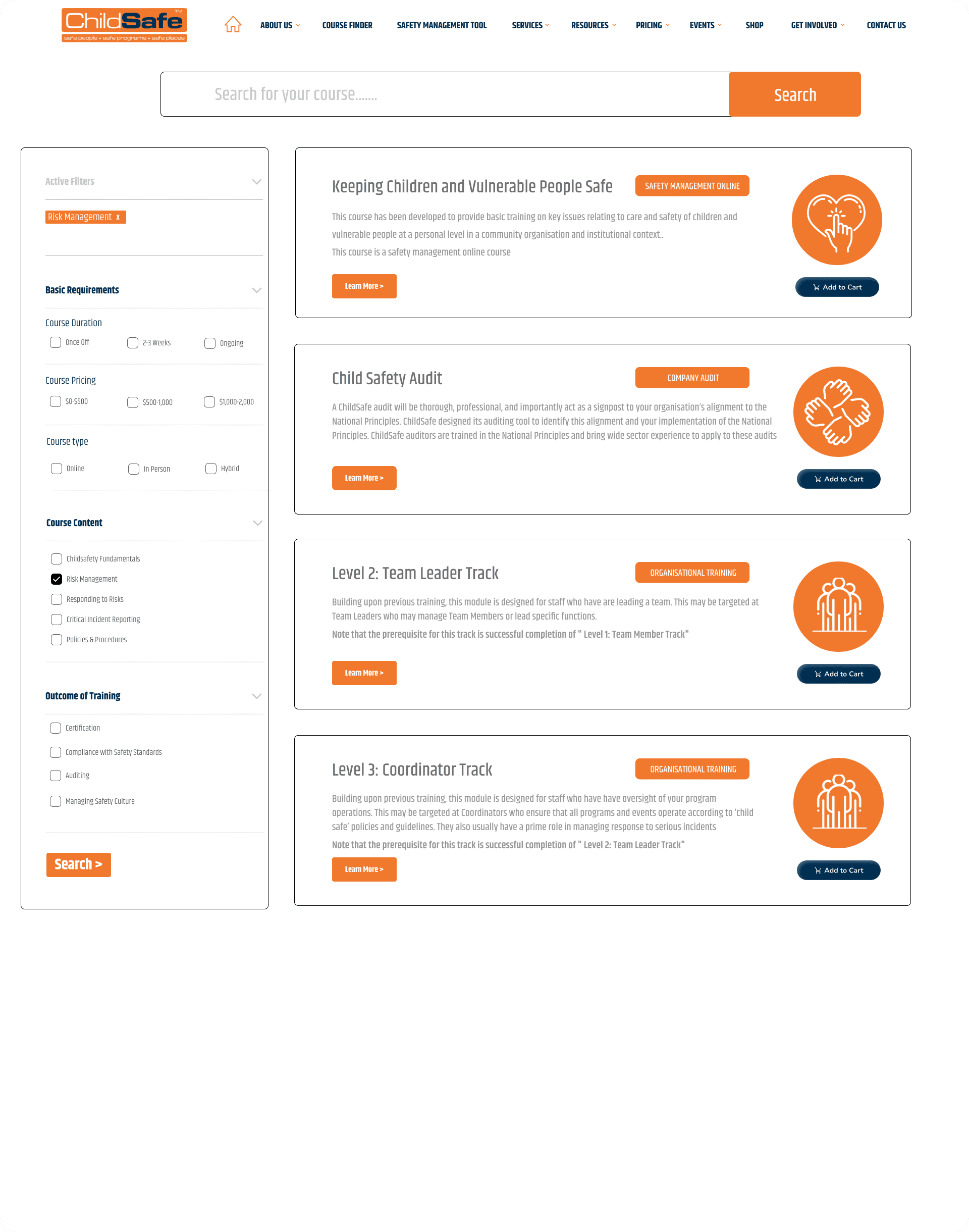
Building Relatability
How might we?
Build trust from ChildSafe to users.
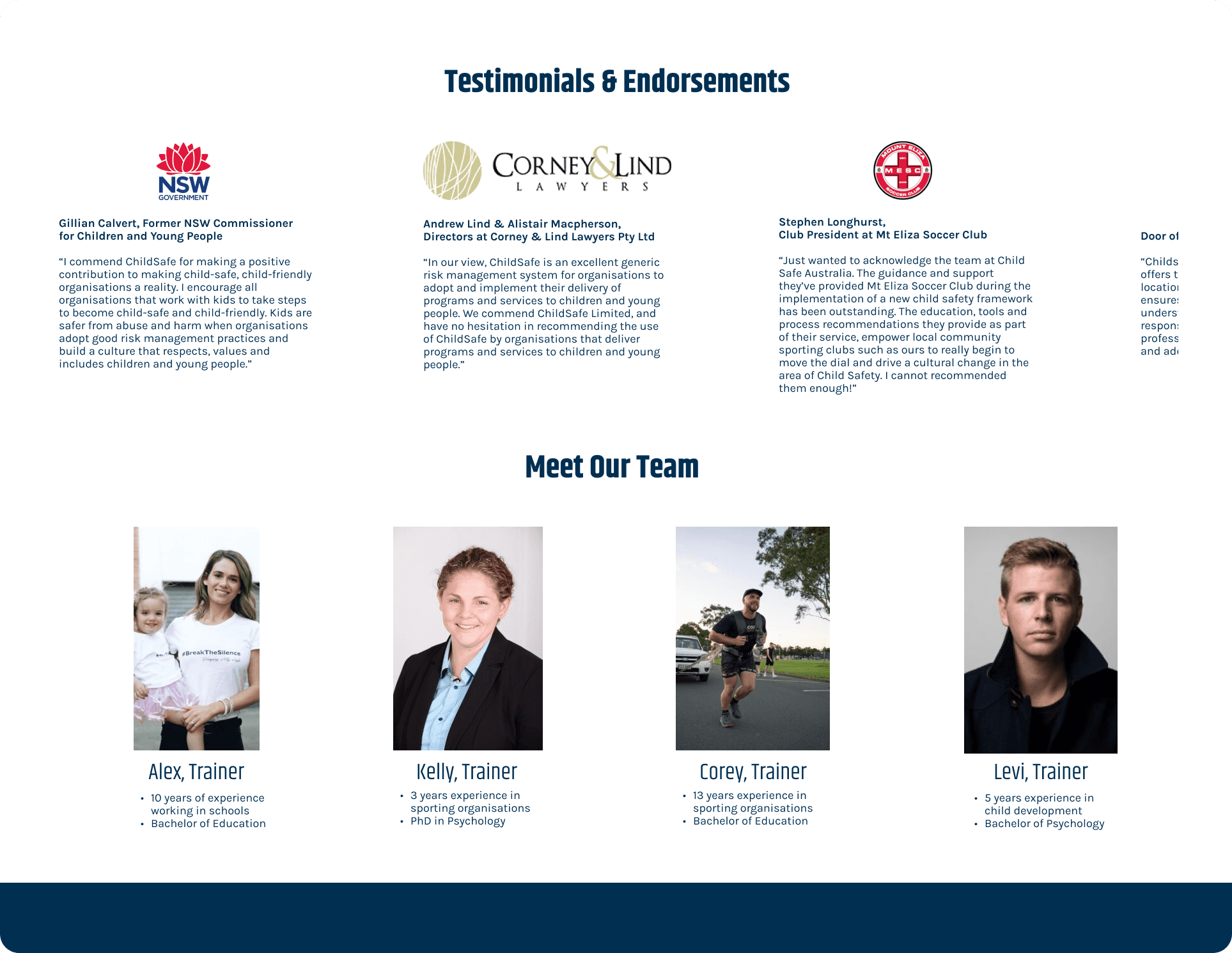
We believed we could enhance trust by presenting on the landing page:
Customers testimonies from various industries
Present the training team with their experience to demonstrate professionalism and legitimacy
Testimonies & Trainers
Intuitive Navigation
How might we?
Reduce frustration and bouncing rate.
We believed we could improve the navigation with 2 actions:
Restructure the Information Architecture through card sorting.
Redesign the Homepage, adding our insights to it.
New Information Architecture


New Navigation Bar


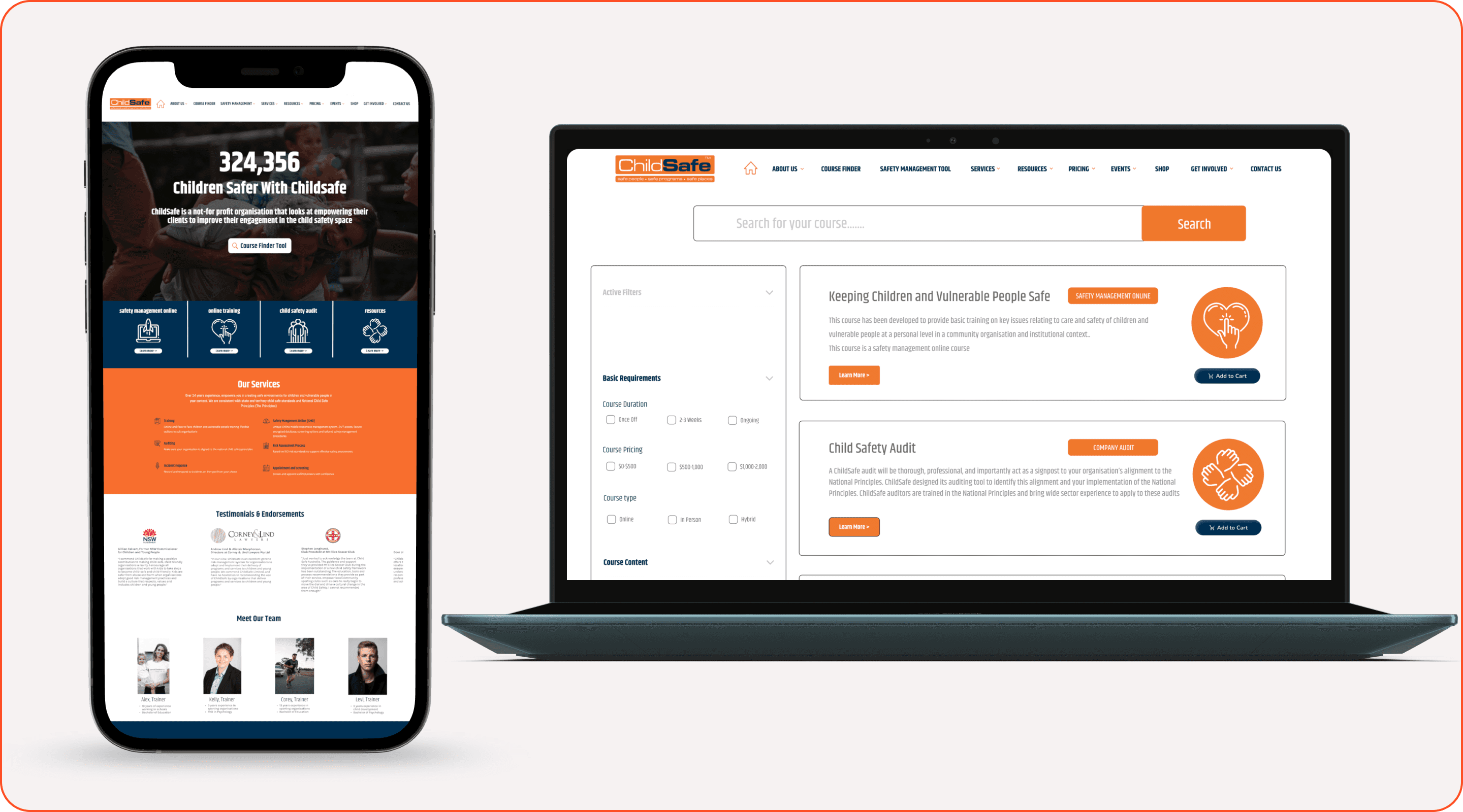
New Homepage
We designed a new landing page, implementing our solutions:
Easy access to the course finder in the Hero section.
Links to main services.
Presentation of all services.
Exhibiting testimonies and introducing trainers.

Conclusion
Through testing and analysing user feedback on our prototype, we have established that:
Restructuring the information architecture, simplified navigation and reduced user confusion, leading to a 25% decrease in bounce rates and a 15% improvement in task completion times.
Improving accessibility and service presentation, contributed to a 30% increase in the conversion rate.
Last but not least, we tackled the challenge of being a 8 people-team working over the Christmas/New Year holidays.
Moving forward, We would refine our approach by gathering more data and exploring further optimisations.