Chirimoya
Web Design
UX/UI Design
UX Research
E-Commerce
Responsive
Interactive Design
Scroll Animation
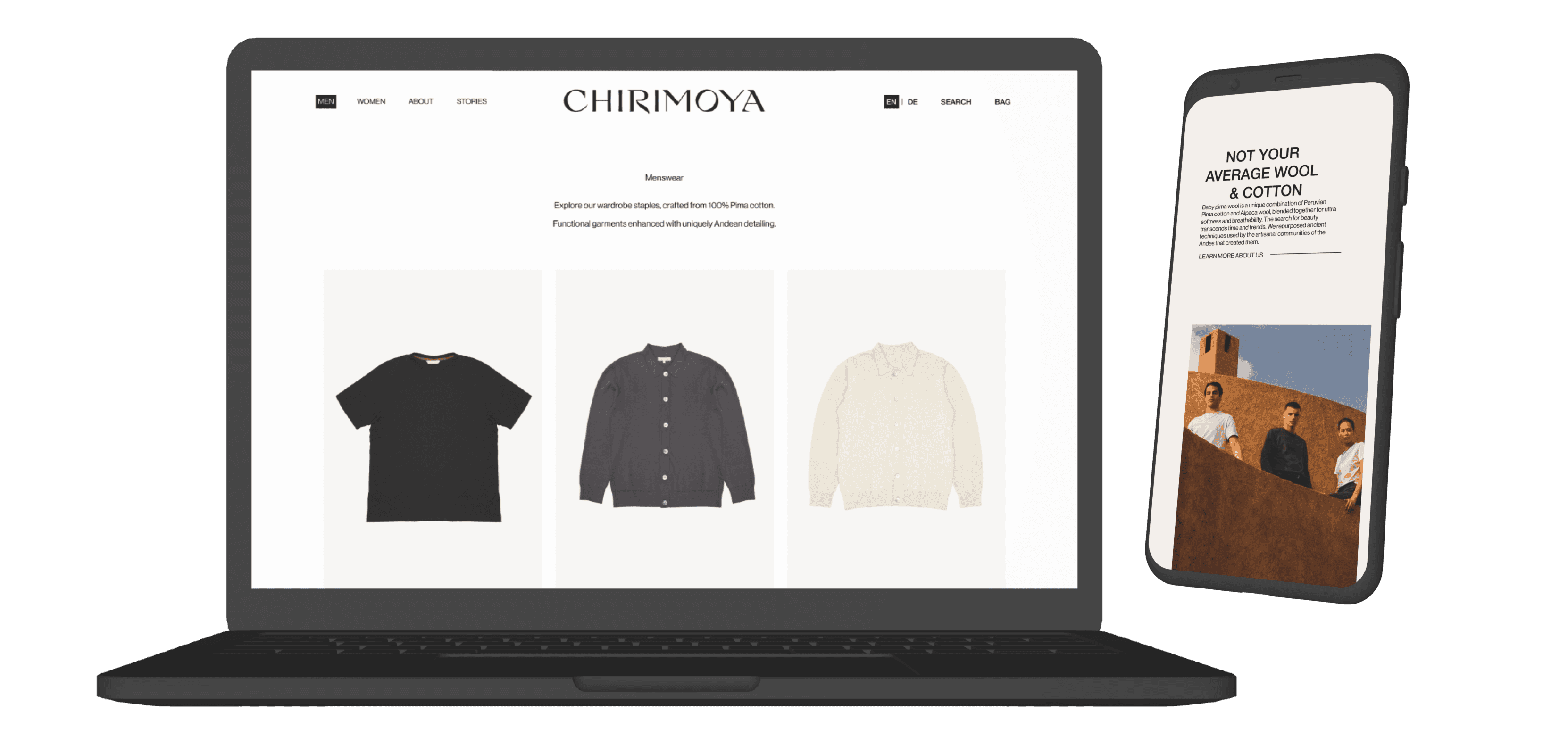

The brief
Chirimoya is a sustainable fashion label specialising in timeless basics crafted from responsibly and ethically sourced material.
Not knowing what was wrong with their website, they wanted to elevate their aesthetic with a redesign of their landing page and products presentation.
My role
I was hired as a UX/UI designer, overseeing the design process from initial concept to final handoff.
I conducted user research, created wireframes, and designed high-fidelity prototypes aligning with the brand's aesthetic vision.
The cherry on top: Working across different time zones
All the stakeholders were spread across different time zones, up to 10-hour difference.
Establishing a structured communication was critical. We set regular touch-points and clear documentation ensured timely updates and feedback.
By managing time differences proactively, we minimised delays, maintained team alignment, and kept the project on schedule.

Users Interviews & Testings
I conducted 5 user interviews and usability testings with savvy online shoppers.
My goal was to learn more about online shopping and investigate the website.
Interview Template
Scenario Template
The Insights
According to my research, users struggled with:
Navigation & Interaction Issues
Visual Accessibility
Clarity & Information Overload
"I don't like going back and forth between pages"
"The order of selection is odd"
"I can't swap between colours"
"I can't tell if the product is worth that much"
"The pictures are too small and their quality really bad"
"I can't zoom on details"
"The background blend with the product"
"What is the currency?"
"There is too much reading on the description"
"I'm not sure if I selected the size I need"
"I don't care about that information"
Competitive Analysis
By combining user research with competitive analysis, I identified key design patterns and opportunities to effectively address Chirimoya’s challenges.
Here are my solutions.
Products Redesign
Refining products presentation, elevating aesthetics and improving usability.
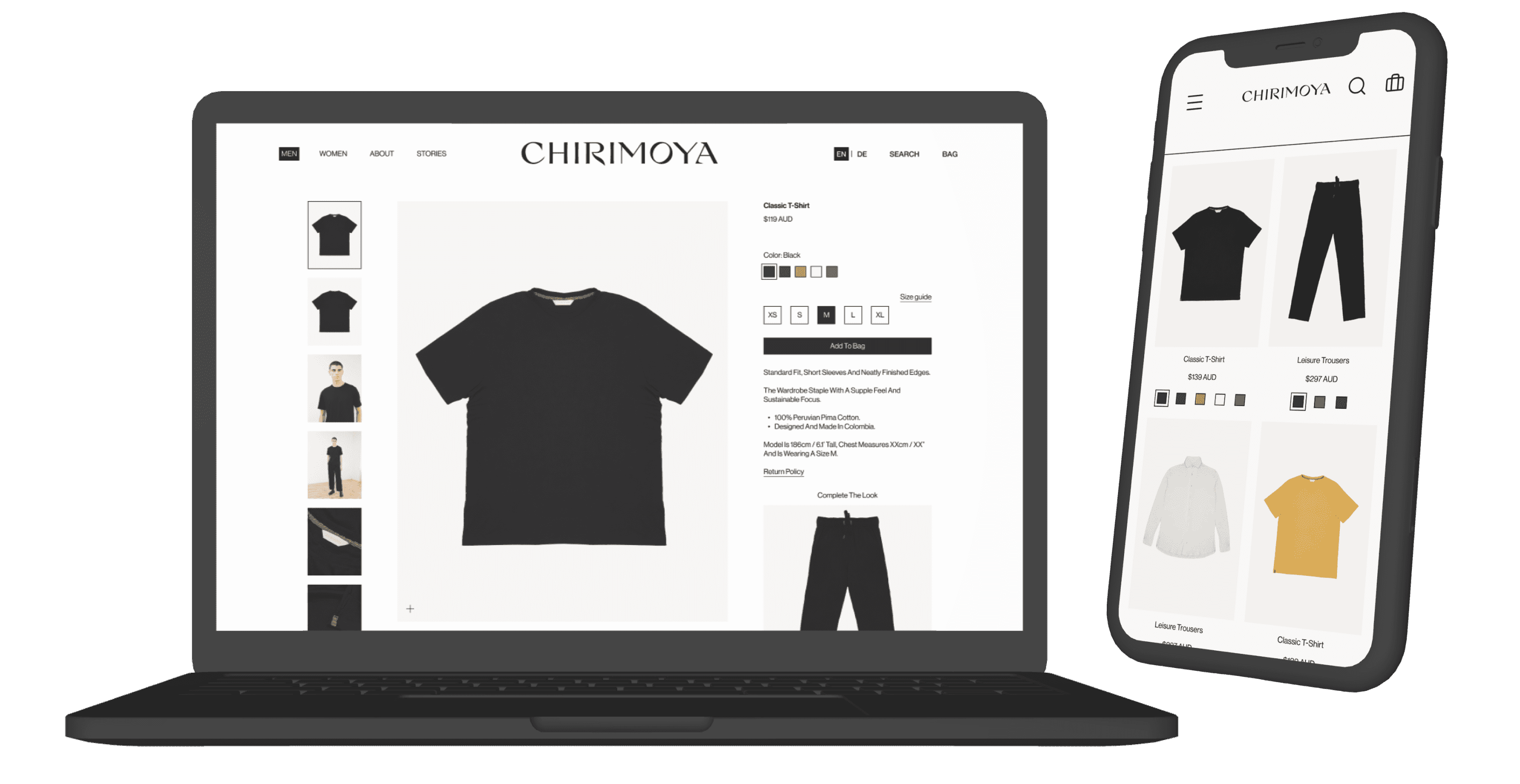

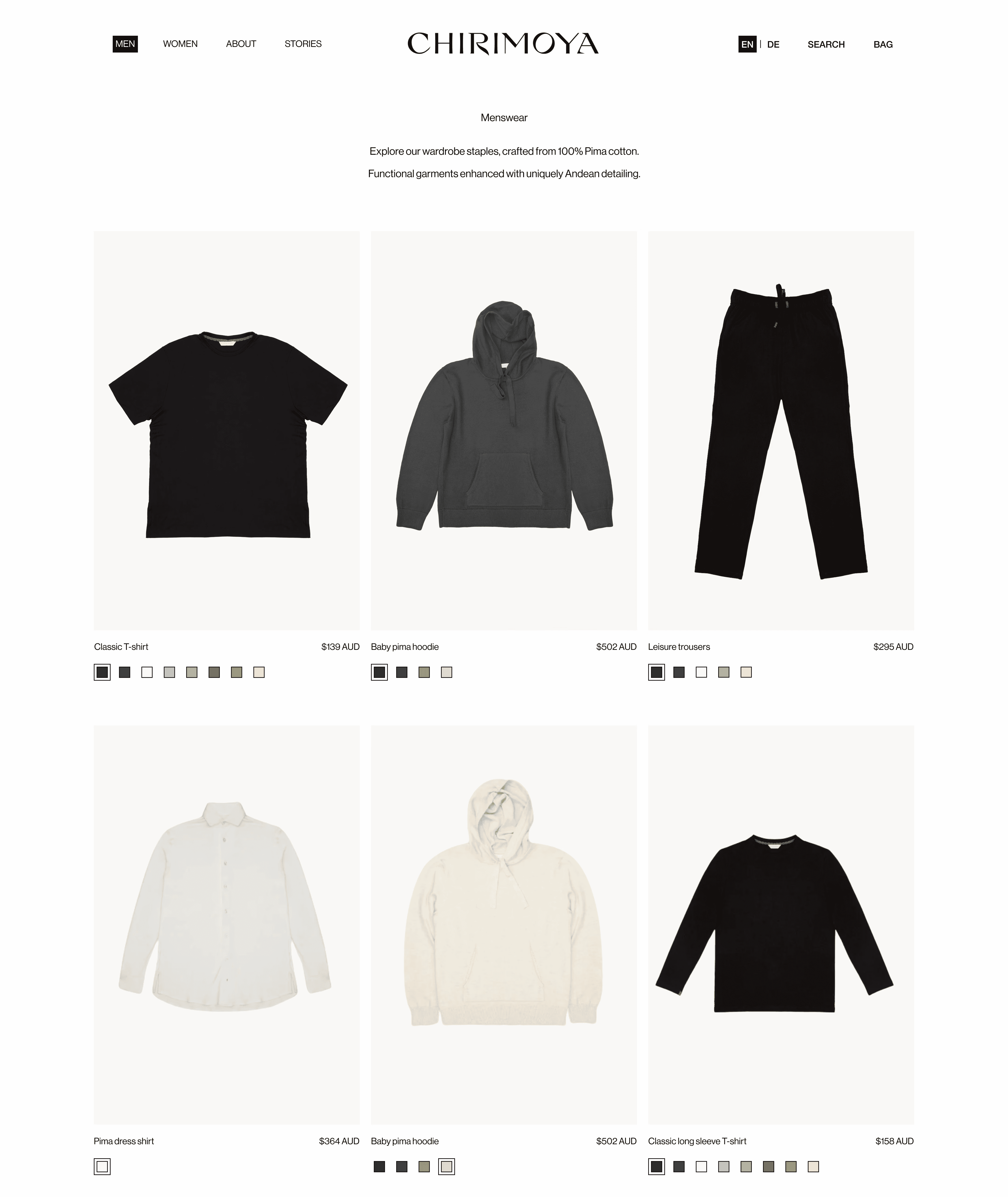
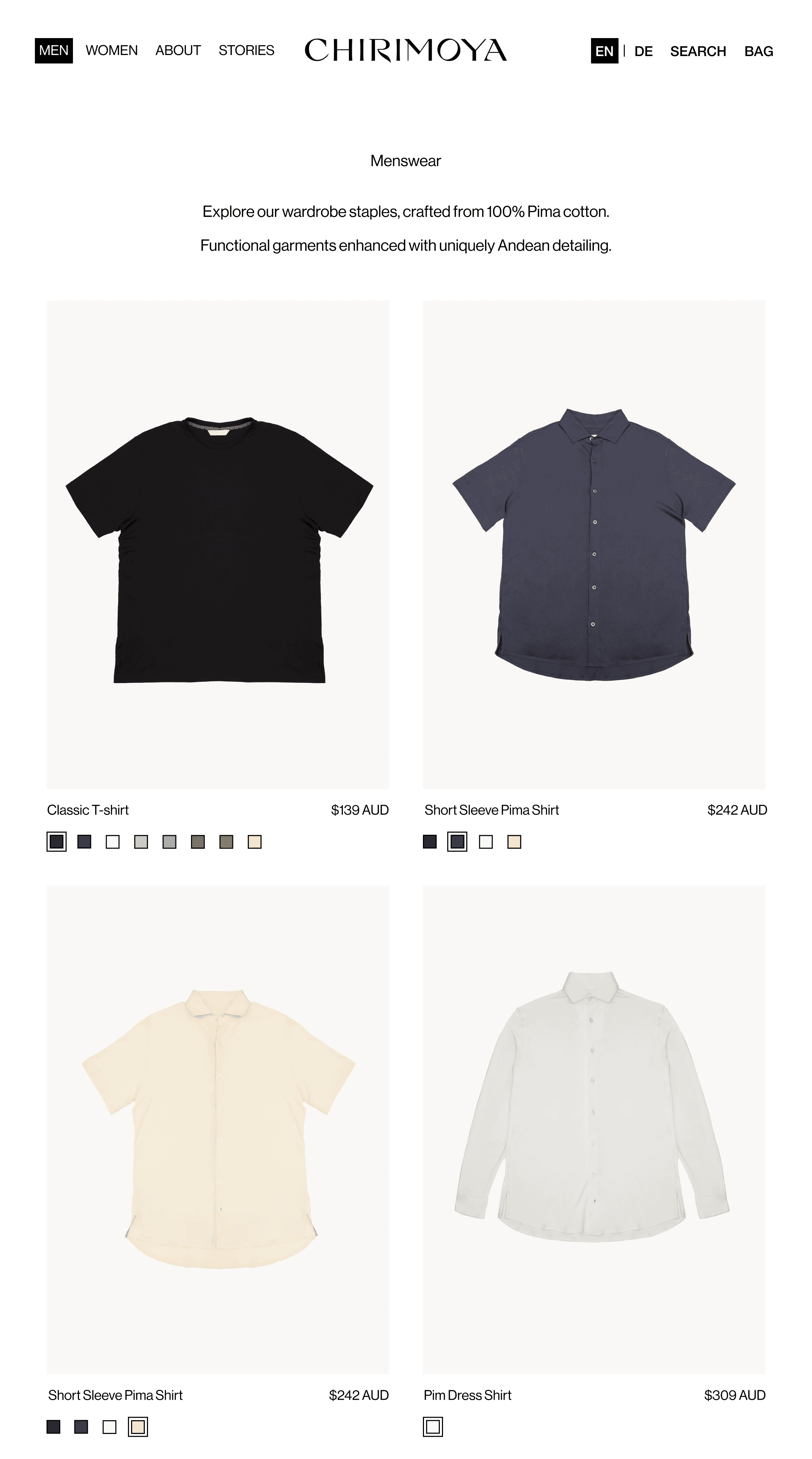
Product Listing: Improving Display & Accessibility
- Increasing image sizes, improving product visibility.
- Reordering images for uniformity: flat lay first, photoshoot on hover.
- Adding clear colour selection and garment swapping, enhancing accessibility.
- Displaying currency details, reducing confusion.
- Adjusting background colours, ensuring strong contrast for better product visibility.
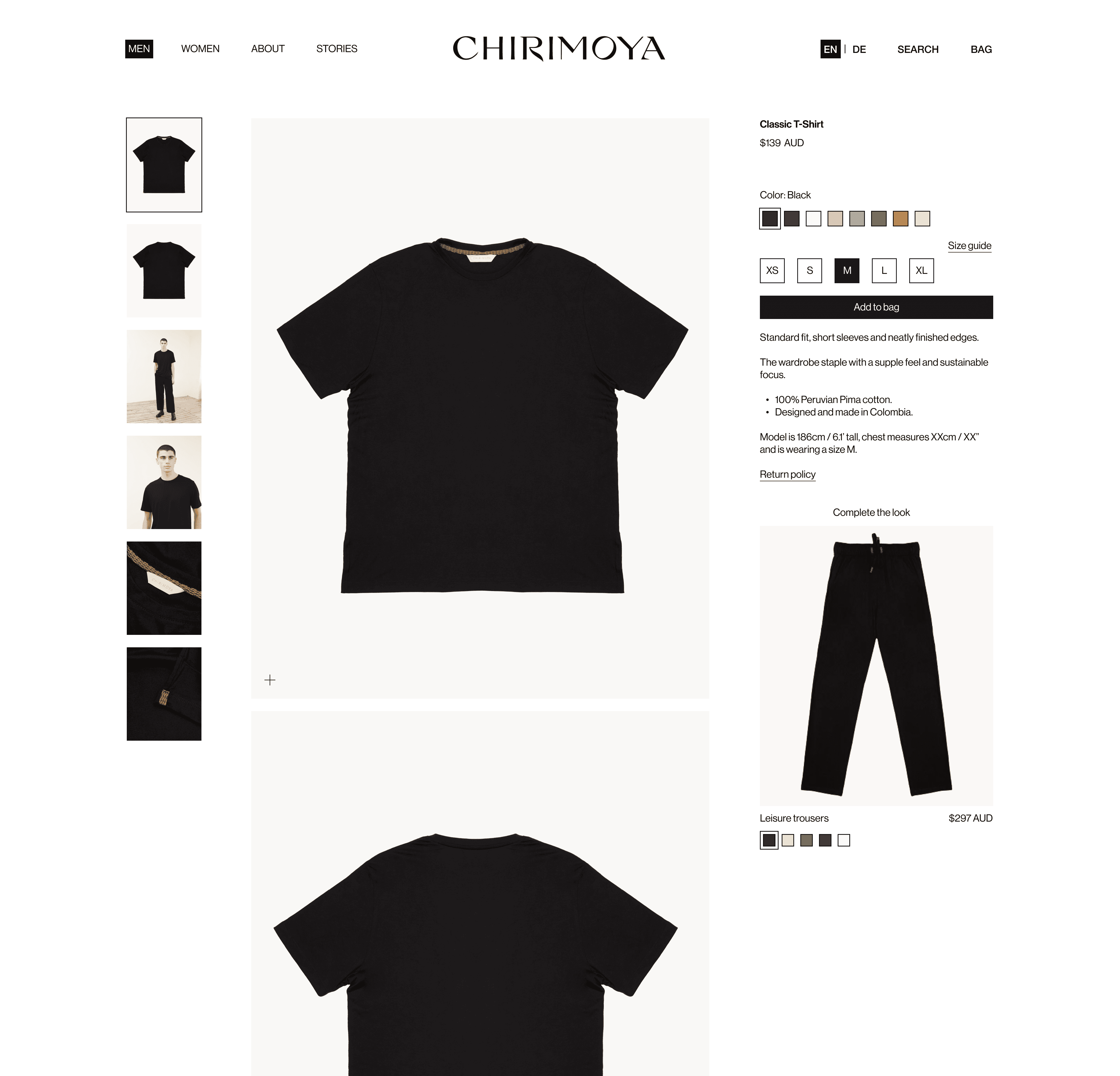
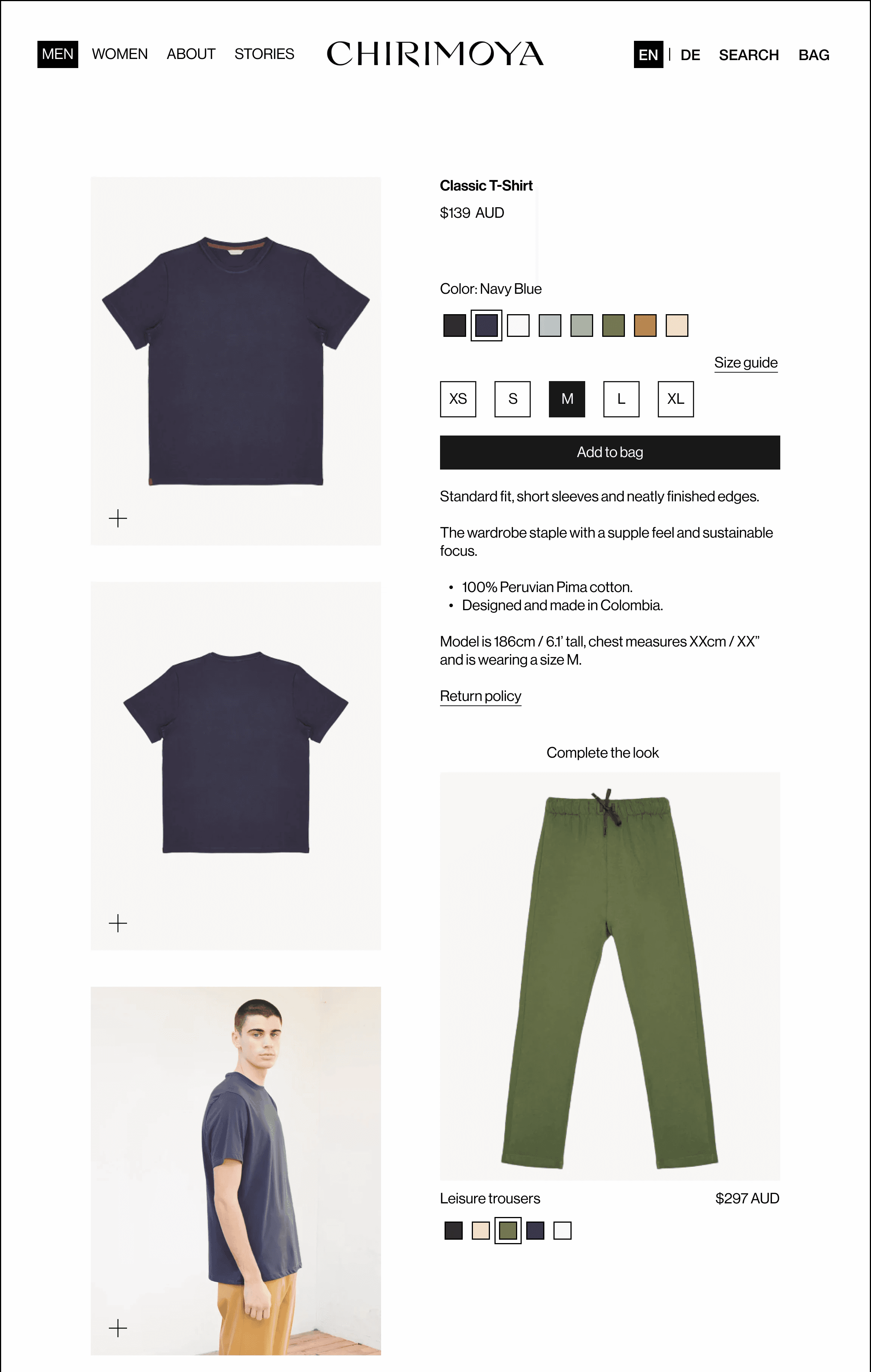
Product Detail Design: Refining Product Discovery
The objective was to create a fluid, frictionless shopping experience where essential information—such as product materials, sizes, and care instructions—is easily accessible without unnecessary interactions.
I preserved the site’s clean aesthetic while refining its sophistication and usability to highlight the brand’s core qualities.
Key modifications included:
Increasing garment image sizes, enhancing product visibility.
Reordering garment information (name, price, colours, sizes) to align with shopping decisions.
Restructuring image order: flat lay first, photoshoot second, details last, matching user preferences.
Adding clear colour labels and selection outlines, improving accessibility.
Linking size guides and return policies, reducing cognitive overload.
Simplifying garment details into bullet points, enhancing clarity and readability.
Including model measurements, aiding accurate size selection.
Introducing a “Complete the Look” feature, boosting navigation and sales.
Landing Redesign
Crafting an engaging landing page showcasing a premium fashion label's values and products.
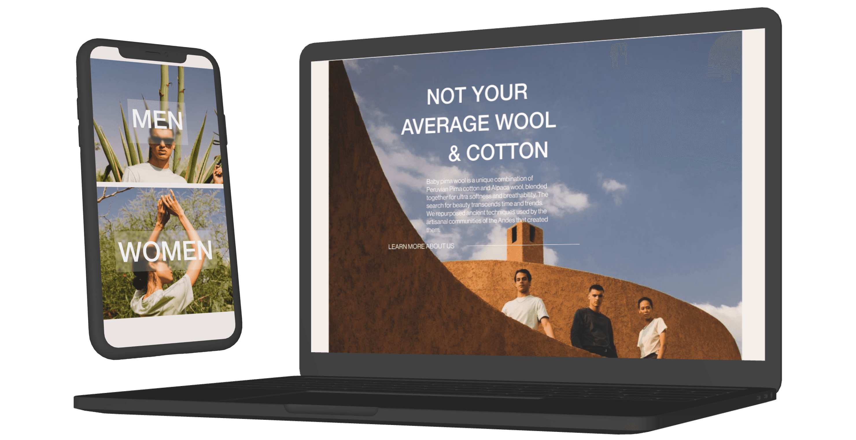

Overview
The redesigned landing page seamlessly blends storytelling and functionality to create an immersive, engaging browsing experience that aligns with Chirimoya’s values.
1- Taking Users to the Source
Research revealed that users deeply care about the origin and sustainability of Chirimoya’s garments. They value products that are ethically sourced and environmentally responsible. To highlight this, the hero section features a short aerial video of the Andean farmlands where Chirimoya’s materials are sustainably grown and ethically harvested, immediately grounding users in the brand’s story.
2- Inviting Exploration
After establishing trust through transparency, the next step was to spark curiosity about product quality. A scroll-triggered animation subtly highlights the luxurious materials, leading users to the About Us page for deeper insights.
3- A Dynamic Product Showcase
To keep the product presentation fresh and engaging, we introduced a subtle scroll and color animation that adapts to seasonal collections and promotions, ensuring a dynamic and evolving experience.
4- Seamless Shopping Flow
Finally, a well-integrated call-to-action guides users effortlessly toward their next step, maintaining a natural flow while standing out just enough to encourage action.
Explore the prototypes below to see the design in action.
Conclusion
The redesign of Chirimoya’s product pages successfully enhanced the shopping experience, leading to measurable improvements in user engagement and conversion.
Click-through rates increased by 25%, driven by clearer calls to action and an intuitive layout.
Users explored 31% more pages per session, thanks to seamless navigation and dynamic product displays.
The add-to-cart rate grew by 20%, reflecting improved product visibility and selection options.
Additionally, average order value rose by 12.4%, fueled by strategic cross-selling through the “Complete the Look” feature.
Potential next steps could be redesigning the size guide to enhance clarity and usability, making it easier for customers to choose the right fit.
Additionally, improving the About Us section to include more details on product origins, materials, and the artisans and farmers behind the garments could further reinforce Chirimoya’s commitment to transparency and sustainability.


