Chirimoya
Products Pages
UX/UI
UX Research
Website Design
Shopify
Basic CSS
Responsive
Refining garments presentation, elevating aesthetics and improving usability for a premium fashion label.
Refining garments presentation, elevating aesthetics and improving usability for a premium fashion label.







Project In Process
Please come back later !
The brief
Chirimoya is a sustainable clothing brand specializing in luxurious, timeless basics crafted from responsibly sourced Peruvian Pima cotton and Alpaca wool, with a commitment to ethical production rooted in the Andean region. The brand’s mission is to offer garments that combine natural softness and durability while supporting local artisan communities and environmentally conscious practices.
Seeking to refine their online presence, Chirimoya aimed to redesign their product presentation to reflect the premium quality of their offerings and make the online shopping experience as seamless and engaging as possible. This redesign would emphasize clean, modern visuals and user-friendly navigation, creating an experience that feels as thoughtfully crafted as the products themselves.
My role
I was hired as a freelance UX/UI designer, solely responsible for overseeing the entire design process from concept to final handoff with the development team. My role included conducting user research, creating wireframes, and crafting high-fidelity prototypes to align with the brand's aesthetic vision.
I also managed stakeholder expectations through regular check-ins, feedback sessions, and updates, ensuring that the project met both functional and aesthetic goals. Finally, I prepared detailed design documentation and assets to facilitate a smooth transition for the development team, minimising the risk of misinterpretation and ensuring the end product reflected the design vision accurately.
The cherry on top
With the client, designer, and developer spread across time zones—at times with a 10-hour difference—I established an overlapping work window and structured communication. This setup included scheduled, regular touch-points and clear documentation for each phase of the project, ensuring all parties received timely updates and feedback. By proactively managing these time differences, we minimized potential delays, maintained alignment across teams, and kept the project running smoothly and on schedule.


Competitive Analysis
By analysing competitor sites, I gained valuable insights into common design patterns, as well as opportunities for differentiation that align with Chirimoya’s minimalist, high-quality ethos. It helped shape a sober, elevated approach to Chirimoya’s website, suited to their product line of luxurious basics.
Since Chirimoya focuses on essentials and timeless designs, the site needed to reflect this simplicity, avoiding overly complex layouts or bold, distracting elements. Instead,
Users Interviews
To ensure the redesign of Chirimoya’s website resonated with target users, I conducted user interviews focusing on competitor sites within the sustainable and luxury basics market. I gathered insights from a range of users with different shopping preferences and levels of brand familiarity to understand what elements they found most appealing or frustrating across various sites. During the interviews, participants shared their experiences with navigation, product presentation, and brand storytelling, allowing me to identify patterns in user preferences and pain points.
I compiled and analysed this data to extract key takeaways on effective practices in product presentation, site structure, and information clarity. For example, users expressed a strong preference for clear, concise product information and visually appealing layouts that don’t overwhelm with text or complex navigation. This feedback informed strategic design choices on Chirimoya’s website, such as enhancing readability, improving product visibility, and streamlining navigation. By incorporating these user-driven insights, the redesign not only aligned with best practices but also catered directly to the preferences of Chirimoya’s target audience, resulting in a more intuitive and engaging user experience.


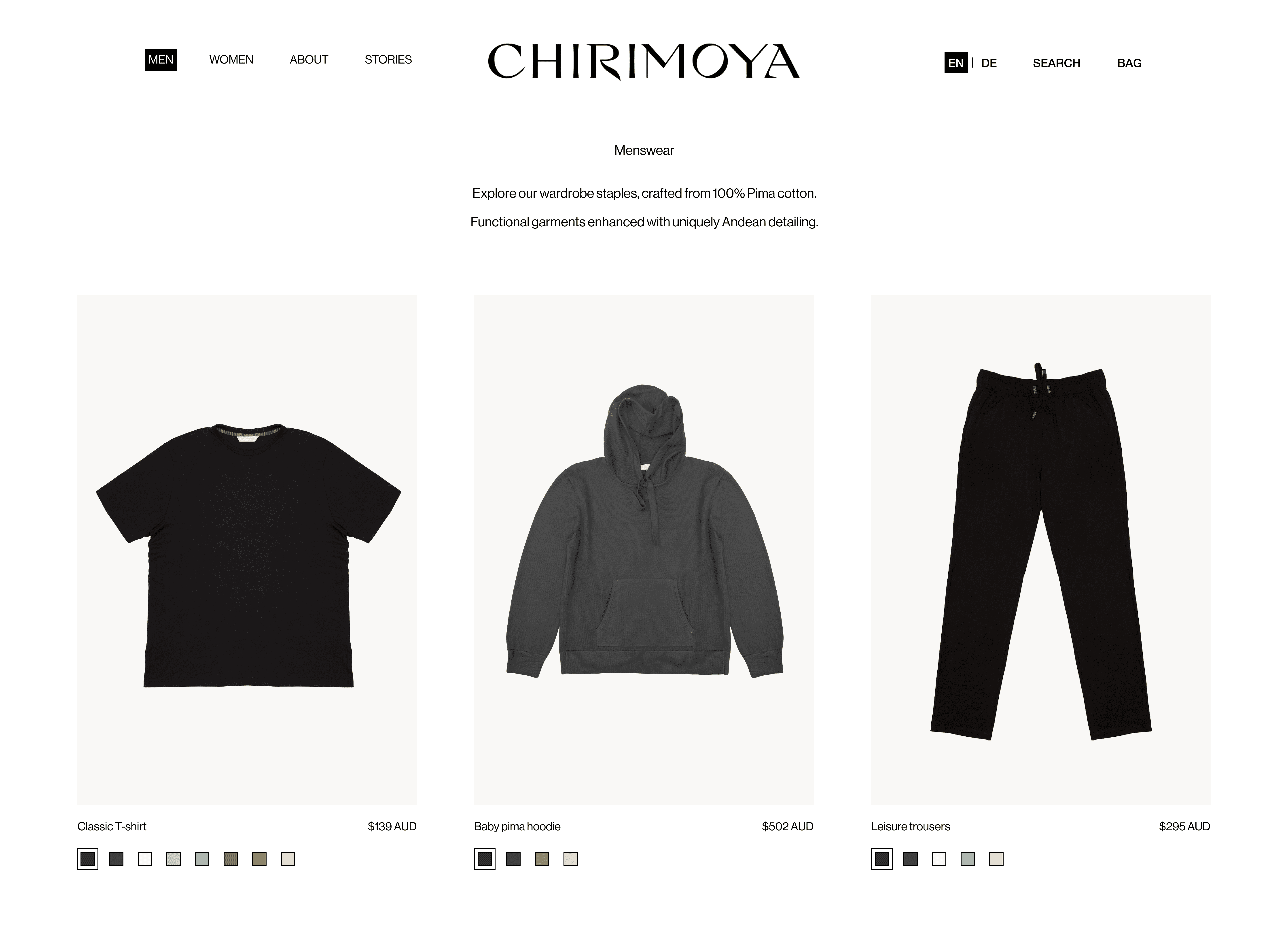
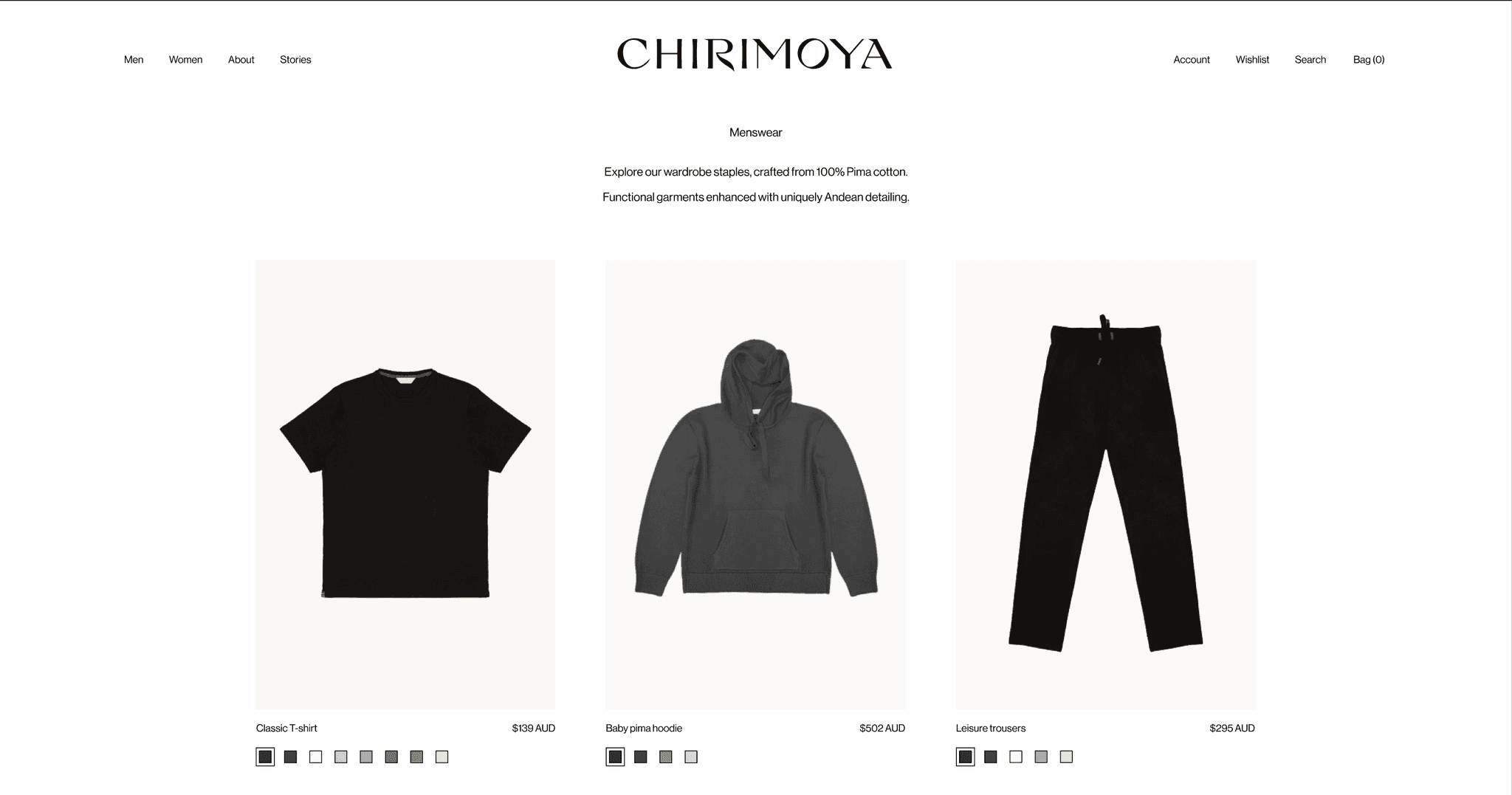
Product Listing Page
The modifications/additions includes:
Increasing garments pictures sizes, letting the product speak
Modifying the product pictures order
First flat lay
Second product shot on hover.
Which create a sense of uniformity and clean visuals
Adding clear selection and the ability to swap between garments on colors selection, improving accessibility
Adding currency, improving accessibility and reducing frustration
Modified background color for the garments, improving accessibility as some garments were blending in with the background.
Prototype
See it for
yourself
Website
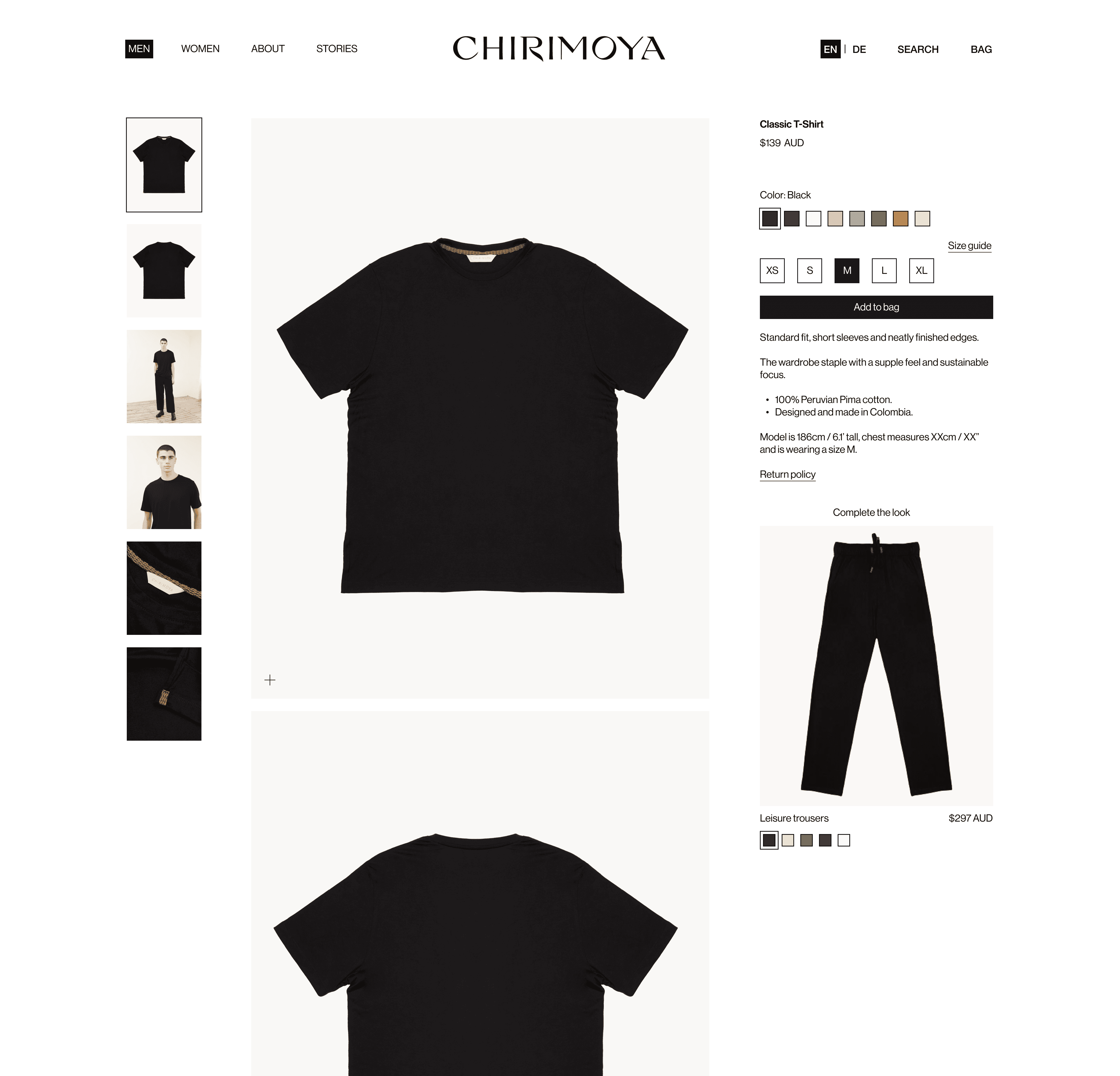
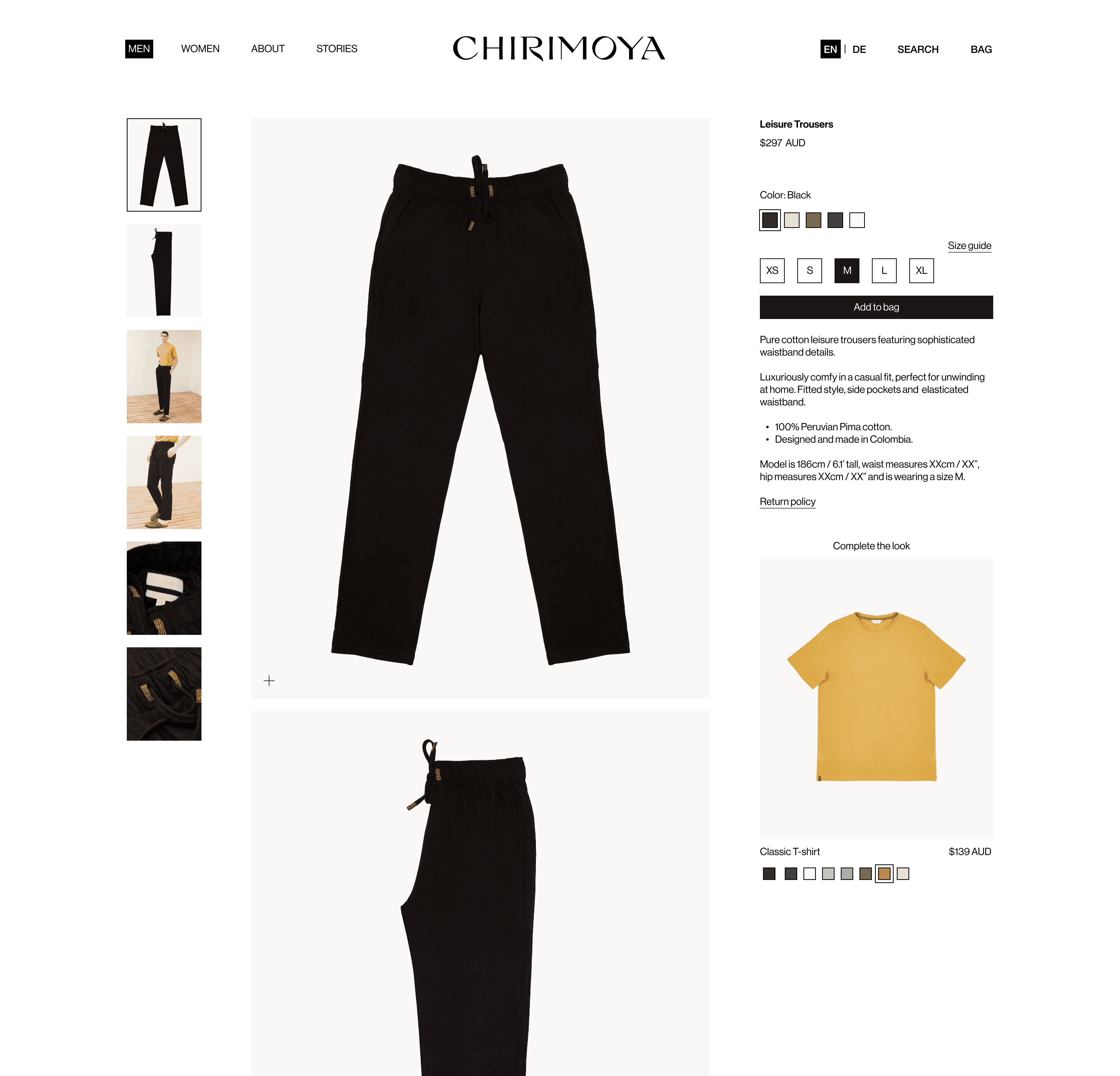
Product Detail Page
The objective is to reduce friction for a fluid shopping experience.
For Chirimoya, this approach involves designing pages where essential information—like product materials, sizes, and care instructions—is clearly displayed and easy to access without excessive scrolling or clicks.
This frictionless approach aligns with Chirimoya’s ethos of simplicity and quality, ensuring the garment, not the interface, remains the highlight of the experience.
I preserved the original clean look of the site, carefully enhancing it to emphasise refinement and sophistication while ensuring the brand’s core qualities were prominent. This allowed Chirimoya to retain its unique identity within the luxury basics market, standing out through subtle, impactful design that speaks to their positioning in the luxury space without overstating it.
The modifications/additions includes:
Increasing garments pictures sizes, letting the product speak
Modifying order of garment information (ie. garment name, price, colors, sizes), fitting the order of shopping decisions
Modifying the pictures order, fitting the users interest:
First, flat lay
Second, product shot
Third, product details
Adding names and contouring on colors selection, increasing accessibility
Adding size guide and return policy as page link, reducing cognitive overload through the amount of visual information
Reducing garments information to key points and adding bullet points, increasing accessibility and reducing cognitive overload through the amount of visual information
Addition of models measurements, to ensure the users is able to make the right size decision
Adding a "Complete the look" feature, improving navigation and potentially increasing sales
